Research
Drawing With Line
In our first workshop we had to produce a range of techniques in our drawings from objects around the room.
In our first task we had to take our own show & draw it from memory, which meant we had to take a 1 minute look then put it out of view .
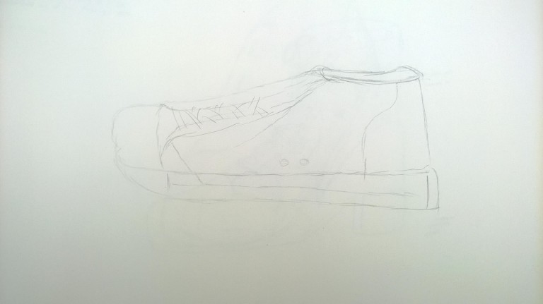
Here is my result of the first task. I think that it is a good attempt as I think that it is a good representation of memory skills & I think that I got some of the dimensions right. However, the shoe to me didn’t look very good because I got some of angles of the shoe wrong, so next time I think I need to look into this more.
In our second task we each had to randomly give someone our shoe to one of our peers & I had to draw it with my right hand.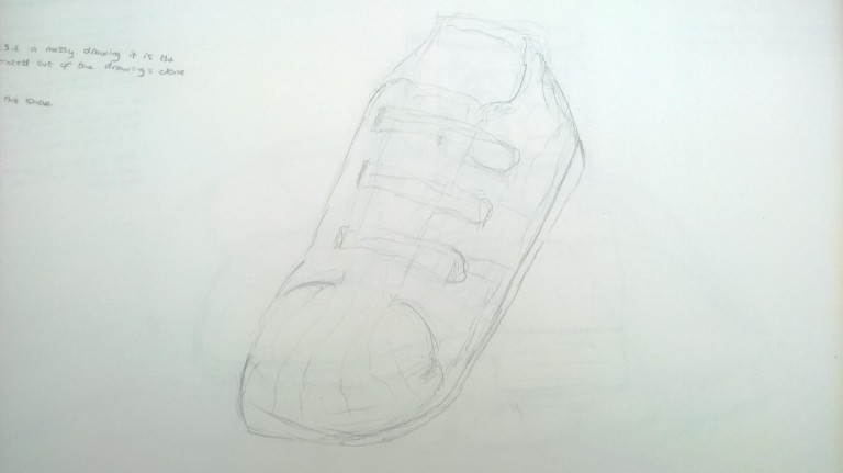
Here is my attempt at this task. I think that this is an good attempt at this technique even though my right hand isn’t usually the one I use for regular tasks. I think that this was an interesting task because I found out that I can sketch with my left as well as my right.
In our third task for this unit workshop we were tasked in drawing in different techniques, so for objects we each had given one of our shoes to our partner & then drew them.

This is my line drawing of my peer’s shoes & it is one of my first attempts at doing this particular technique. I think that this is a good first try at this technique because I was able to capture the detail & every section without having to stop drawing to look at the object.
With this drawing technique we had to get one of our peers shoes & then we had to draw it with the hardness of our pencil without taking it off of the paper.

With this drawing technique we had to get one of our peers bags instead & then again draw them, but this time we had to direct our pencil on an angle without taking it off of the paper.

This is my angled pencil line drawing of my peer’s bag. I think that I did very well with this drawing because most of the time I draw in this style anyway, so I think that I was able to capture the object quite well .
Perspective Drawing
Today we tried our hand at drawing in perspective. We approached this task by being sent out & finding a part of the college to draw from.

This picture is a bit farther away from where I was sitting, but from the fire extinguisher halfway down on the left is where I did my drawing.
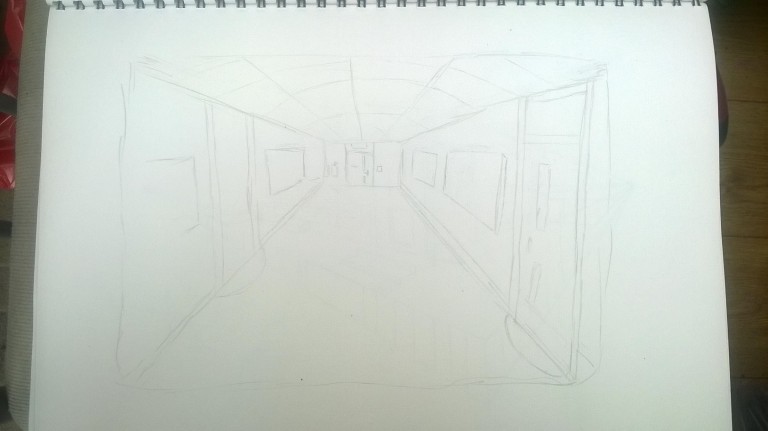
Here is my first perspective drawing. I think that this is a good attempt, however I could do better because some of it still does not look in perspective. I think that I will try to improve upon this in my next drawing.

This is my perspective drawing. I think that this is an improvement from my first perspective drawing because I think that I have captured the angles better & I think that I drew the dimensions of this drawing better because the bricks & the windows are structured better & are in the right place & angle. However, there is room for improvement because I think that the fence in this drawing could be changed because it doesn’t look like it is at the right perspective.
Constructive Drawing
Monday 28th September 2015
In todays workshop we were tasked to do some constructive drawing from objects that our teacher had set out for us in the middle of the room.
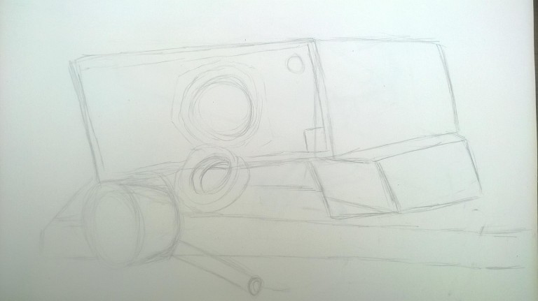
Here is my first attempt at a constructive drawing. Although this isn’t one of my best, I still think it is a good attempt at this task. I think this because I managed in some way to put these objects within in the right dimensions. However, my constructive drawings could use some work, so next time I need to reflect on what to do differently.

This is my charcoal drawing. I think that this second attempt at a constructive drawing is an improvement from the pencil drawing because I was able to add tone to my drawing by smudging the charcoal. I was also able to make the dimensions between each object clearer, however I think that I could improve this more by adding detail & angle some of the objects correctly to make my drawing more effective.
Week 5- Framework Drawing & Measuring
Monday 5th October 2015
In this lesson we had to revisit & improve positive & negative shape drawing. In order to accomplish this task, our tutor gathered some random objects from around the room & placed them in an abstract way on the table. After this we had to draw these objects using perspective.

Overall, I think the outcome of my attempt was positive. I believe this because I think that this attempt was more accurate to the object & I think that most of the drawing was in perspective and it more or less like the object
Week 6-Constructing the Human Form
For todays task we had to study the human form. I think that this task was very useful because it gave me a deeper understanding of drawing a certain pose. Also, it helped me to understand the dimensions of the body from the angle of the way the person is standing & how the form is structured.

Here are some of my own drawings of the human form. I think that this task was one of my favourites because you didn’t have to draw a full refined version of a human, instead we just drew the stick versions of them in the right form. We also then had to add upon this & add another layer around the stick version, which was drawn in order to show a process of how a human drawing can be made which starts as a stick form & then develops in to a drawing of the human form.
Week 7- Heads & Hands
For todays workshop we worked on how draw faces & hands. First of all we looked at some examples of heads of the human form & then we had to practice by drawing one of our peer’s front view & side view of their head.
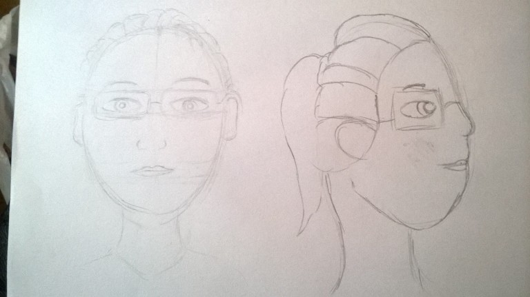
After this we looked at examples of different angles of how a head is positioned, so we again practiced this by drawing our peers.
I think that these two attempts at drawing faces was a good practice because I got to learn how to draw faces from different angles.
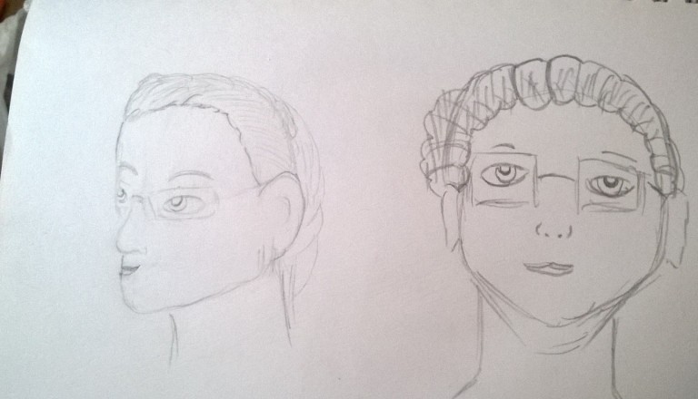
The next thing we did was draw different head shapes & faces to show that there are many different kinds of ways to draw faces, so again we practised drawing these different styles.


Here is my drawing of the heads above this one. I think that this is a very good attempt & I think that I have captured the dimensions of each face quite well.

Here is the process of my own construction of a hand drawing. I think that this is a good attempt & I think that this was a very effective task, because by doing this task I learned how to construct a hand from just a few lines & I think that I will use this technique for future projects.
Research- Concept Art
Concept art is a form of illustration used to convey an idea for use in multiple forms such as films, video games, animation, or comic books before it is put into the final product. Concept art is also referred to as visual development or concept design.
To start of my research for the concept art portion of this unit I first researched up some examples of other artists pieces.

#Camila Vielmond #concept art #fantasy
I chose this artists piece of concept art because I mainly like the theme of fantasy. I think that this character in particular is very interesting as the design of her is quite traditional & I love the aspect of magic, which she is conjuring in her hand. I think that I may use this style in my own development of my concept art.

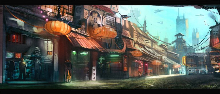
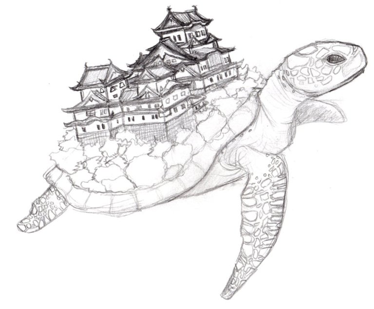
Dzalou Freshwater Mangrove by Jesse van Dijk
I chose this artists piece of artwork because I love the theme of fantasy specifically because you have the ability to experiment with anything you want. Like the picture above for example because instead of having houses on the ground it has been built into a large tree which expands on to others.

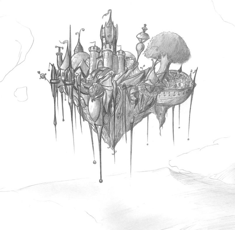
#matt rhodes #dragon age: inquisition
I think that this piece is very interesting as it appeals to my own curiosity. I say this because the island in the picture to me gives off a sense of mystery as you don’t know why the artist chose this particular setting for his art. It also makes you ask questions like, what is the purpose of this island?, Is it important? & What is its story?

I chose this artists piece of artwork because I find the style that this artist has used for these characters is very interesting because it is a mix between futuristic with the female in the middle having a weapon for a hand & fantasy with the armour, magic etc.

I chose this artists piece of artwork because I find it interesting that someone has took the modern ironman armour & has transformed it into a completely different style which is steampunk. I also think that this artist has captured this aspect very well & I can actually imagine a steampunk ironman going into battle.
Character Research
For my character I have decided research the medieval theme, because I think that this particular period is very interesting & I have seen this particular theme quite a few times in books & media. However, I am going to do this theme in my vision, so many of the things you see below will not be exactly what I am using like for example the 3rd picture below of the woman in full armour will not be used in my own work because I think this has been used too many times.


For my character designs I have decided to fuse the theme of medieval with a futuristic theme. I am going to do this by giving the characters medieval armour like the one above & then I will add futuristic elements like the neon blue lighting as seen below. This effect will be added to the character’s armour.


This is an example of what type I art I might create, but not to the extent of the two above.
Environment research
With my environment design I want to again fuse the two themes together by creating a medieval/futuristic market with a castle on a floating island in the background. I also want there to be a dragon flying beside the floating island to give a sense of danger. For the market design I want the buildings in the market to be shaped in a structure that was used during medieval times like stone walls, dust covered floor & market stalls. However, I also want to convey the theme of futurism, so I’ll add elements to covey that theme like neon lighting & unique structures that modernise the buildings to give it the theme of old & new.
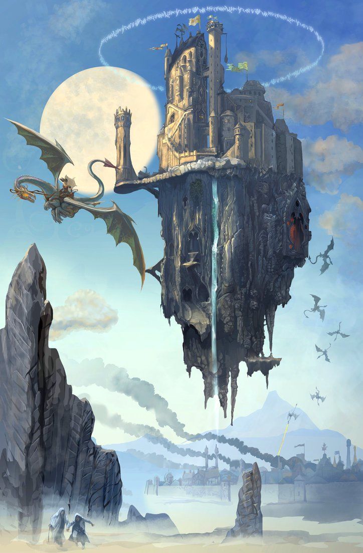
In my environment I want to add in a floating island castle because I think it is an interesting idea as it sort of conveys the theme of medieval/futurism.
Buildings

For my buildings I want to go for a traditional ancient feel as this is set in a different period in time.
Market Design


Since I am designing a market place (Bazar), I have researched some stall designs for my artwork. The style that I have gone for is more like a traditional style because the stalls in my own artwork will look traditional with merchants selling all different things to people like fruit, veg, Jewellery etc.
Civilians


With the civilians in my artwork I have decided to go for a medieval/ traditional look like the ones you see above. However I have tried to make my version unique by giving my civilians a more colourful palette
Tents


As well as market stalls, I also want to add tents to my environment to give a range of different stall designs within my environment to make it more interesting.
Holo Screens
Because the themes I have chosen is medieval/futuristic I have decided to add hologram advertisement screens to my environment because I think it will add a more futuristic theme to the medieval one.
Hover Car
I have also added hover cars to my environment to also convey the theme of futurism to give it the balance of both so that it is not too futuristic or medieval.
Weapons Research
For my character’s weaponry I have decided to go for weapons more appropriate to the the theme I am trying to set. So, my characters will have a sword, a bow & arrow & a gauntlet.


Proposal
The story is set in the world of Orgenon in the small city of Silvan. The story focuses on a young peasant inventor named Nadine & her two hunter friends Laura & Talon.
Story
The festival of light is supposed to be a radiant event where the people celebrate the gods & goddesses of Justice power for keeping the darkness dormant for thousands of years. However, all is not well as Gardath the dragon of chaos awakens & executes everyone in the village of Irien, which is a few villages over from Silvan. However, all is not lost as a young peasant named Nadine discovers that her family are the descendants to Aqdine, Goddess of Enlightenment & are the protectors of the powerful gemstone Aragonite which is the key to stopping Gardath. Now, Nadine with her two warrior hunters Laura & Talon, they must travel on an epic quest to the Plaxhau Mountains in order to defeat Gardath once & for all. However, along the way they must overcome many obstacles & enemies in order to achieve their goal & save their world.
What you will work towards producing?
For this project I will be working towards creating a piece of artwork that is relevant to my chosen themes Futurism & Medieval which has the required three characters. In order to achieve this, I am going to research into these themes to gain a deeper understanding to approaching the task. In my concept art I will work to produce a market theme with a floating castle in the background as well as a menacing dragon behind it.
Influences
Environment
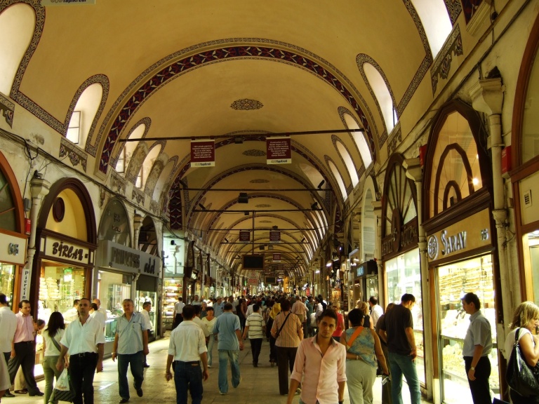
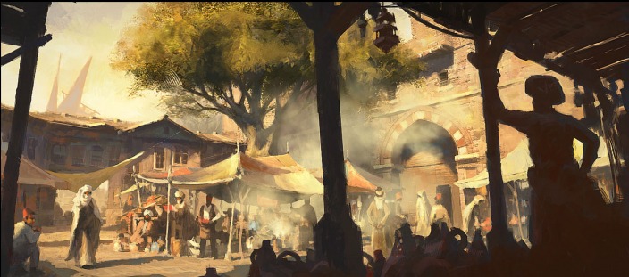
The inspiration that influenced me to create this specific piece of artwork came from places such as Bazars & markets, because I find that these places are very interesting with the bustling crowds & the range of unique objects that are purchased within these events.
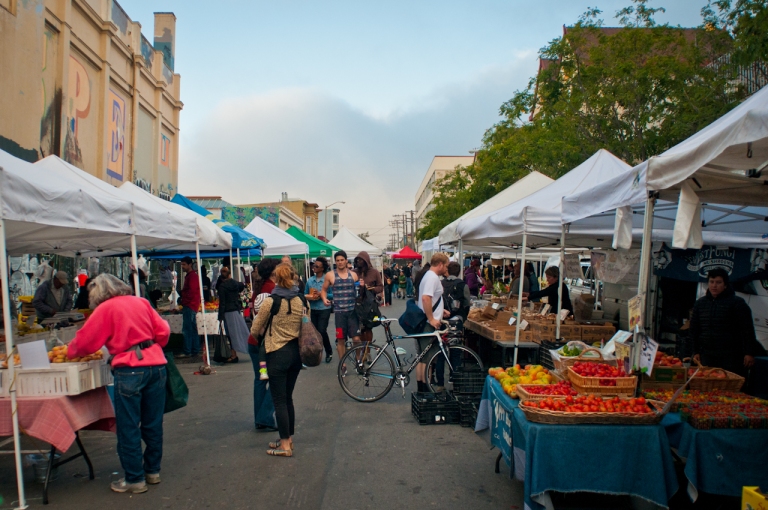
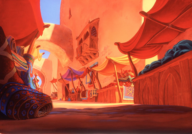
Media has also played a role in my inspiration towards this artwork , like for example the market place from the film Aladdin played a significant role in the inspiration for my own piece because I love the flare of colour & the design of the marketplace that is used for this particular setting for the world that Disney created. I also like that there was a range of things that were going on in the scene like fire breathers, merchants, camel sellers etc.

Games like assassin’s creed also inspired my creation because the amount of detail, colour & traditional theme that was created made you actually feel as if you were walking through a real market place through the character you were playing. This was also conveyed by making your character having to slowly get by hordes of people buying things as well as browsing at the attractions in the market place.
Character Influences
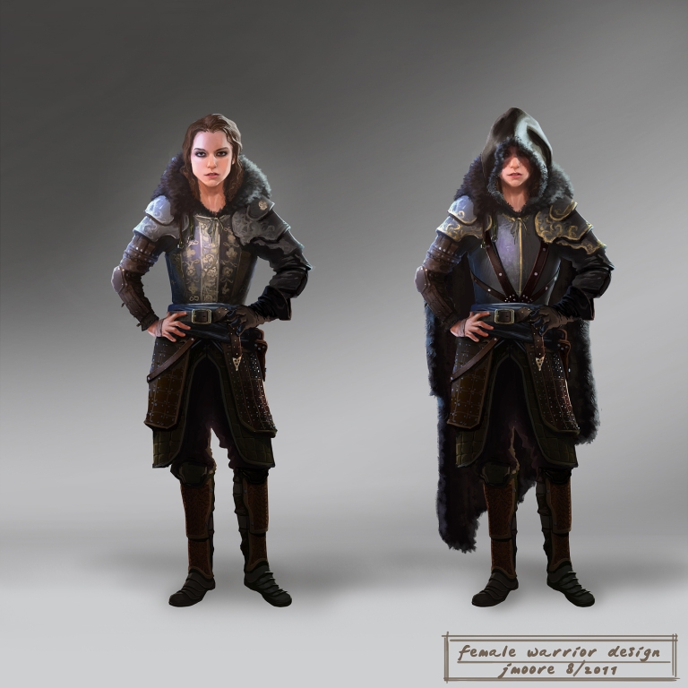
For my first character design I wanted to create a warrior like character. I wanted to design the character in this way because the theme of the artwork is medieval which is associated with knights, mythical creatures etc. However, instead of creating a typical male knight, I created a female knight with only light pieces of armour instead of full body armour. The inspiration for this character came from characters like Xena the warrior princess who was a warrior that fought for the greater good & protected the innocent.

For my second character design I wanted to create a different style because I wanted each of my characters to have contrasting styles to show uniqueness within the three characters. The inspiration for this character came from the medieval theme itself because I feel that this style is like a traditional style with baggy clothing, hoods, cloth, metal etc.
For my third character design I decided to go for a more bulkier character, however instead of being a normal human I have decided to draw this character as an anthropomorphic snow leopard. The inspiration for this character came from films such as Kung Fu Panda & Disney films which has worlds that are filled with unique anthropomorphic animals.
Ideas Generation
Theme Boards
Character 1: Laura
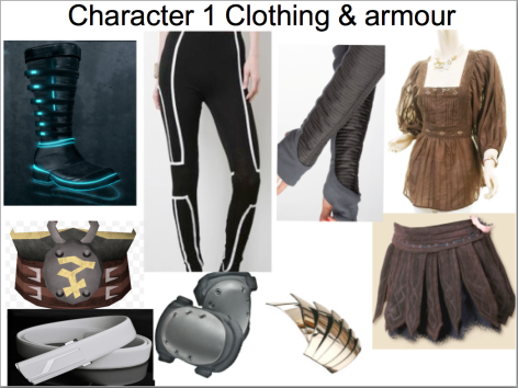
Here is a theme board for my first character (Laura). For her design I have gone for a warrior like design, however I decided to go for the light armour aspect this is because I wanted to do something different from what is shown in media where warriors have heavy armour & artillery. So, for this character I have just added the basics for protection such as: knee pads, elbow pads, shoulder pads, a under guard etc. Also, considering I am mixing a futuristic & medieval theme, I am going to design the character in these themes, like for example the clothing such as the top, the battle skirt & the boots will be designed with a 15th century feel. The futuristic aspect will be conveyed through the armour that is on the character this is because the armour is greatly advanced, so when an enemy hits the specific area it will bounce of a barrier created from the armour.
The colour palette I have chosen for Laura is a mix between futuristic & medieval. The theme of medieval will be conveyed in the characters clothing where the colour theme will be more natural & traditional. The futuristic theme will be conveyed in the characters armour by giving it a more neon feel.
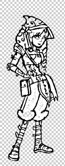
Character 2: Nadine
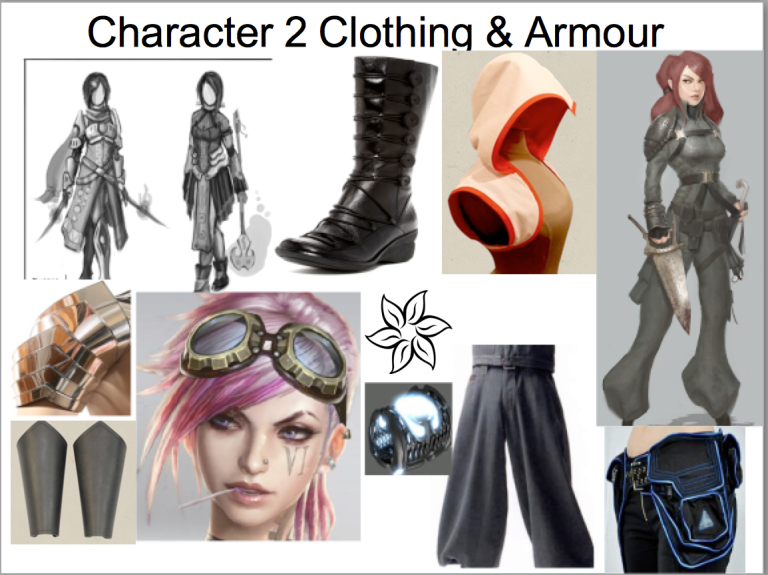
Here is a theme board for my second character (Nadine). For this character’s design, I have decided to go in a different direction to my first character. I have done this by giving my character a more 15th century peasant sort of feel. However, I going to make the character unique by giving her technological advancements like the communicators.
The character’s design will feature a traditional dark & light pink archer hood, grey work goggles, grey & dark pink chest plate armour, light grey arm bracers, dark grey utility belt, light grey shoulder pads, light brown puffy pants, blue communicator, a pink water lily on the hood & brown boots with neon blue soles.
The colour palette that I am going to use for this character is going to be a mix of more brighter selection of colours, the style will of course be a mix of futuristic & medieval. The medieval side of the style will be conveyed in the character’s clothing where the colour theme will be more natural & traditional since the character is a peasant. The futuristic theme will be conveyed in the characters technology & pieces of armour like the arm braces & the elbow & shoulder pads.
Character 3 Talon
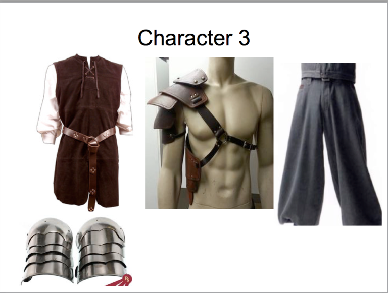
Here is a theme board for my third character (Talon). For this character design I have gone for a more traditional style, which means that this character doesn’t feature as much armour as the other two this is because Talon is a more bulkier character, so he doesn’t require much armour. I have also done this particular design because I wanted to show that the character isn’t just a warrior, he also has a soft side.
The character’s design will feature a red tunic with black vines & golden flowers, a brown belt with gold plating, black puffy pants, beige wraps/ bandages on the legs, a pauldron on the characters shoulder & a cloth with the same style as the tunic that covers over half the pants.
Colour Palette

As said above I have decided to go for a more traditional set of colours as opposed to the futuristic styles of the other two characters. I did this in this way because I wanted to show the contrast of traditional to futuristic.
Environment
For my environment ideas I have decided to go for a more medieval/futuristic theme for my artwork. I have chosen to do this type of theme, because I have never tried these two particular themes together before & I thought that I would give it a shot. Also, because I usually draw in a fantasy/futuristic theme, I wanted to change my style & try something new.
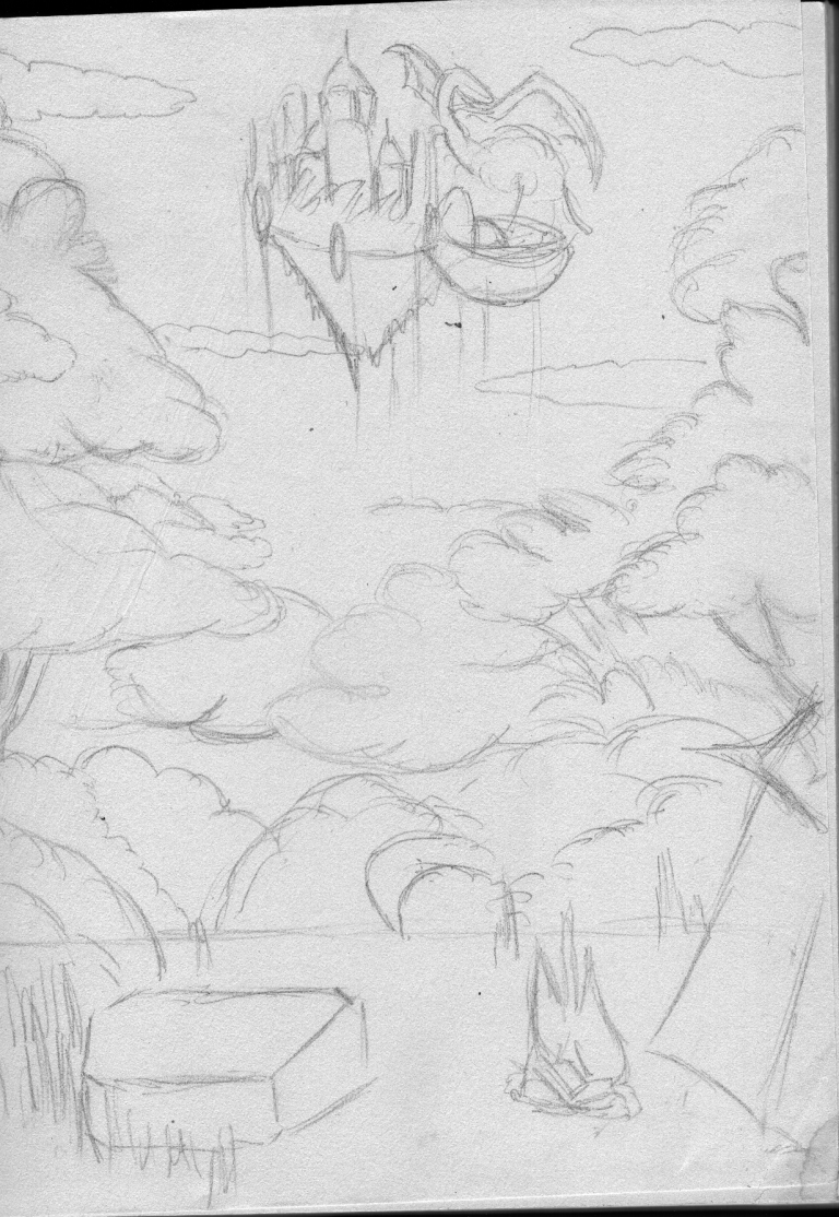
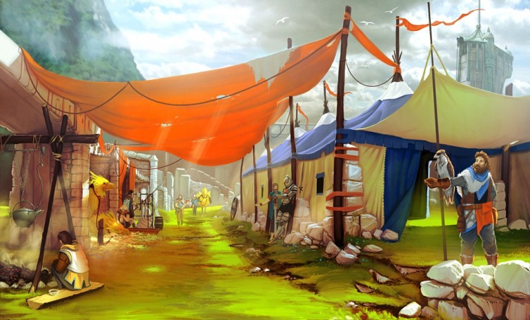
For my first environment idea I have come up with a floating island castle with a dragon behind it conveying a theme of danger. Below, there is a forest overlooking a campsite, which is where the characters would to of stood. I have done this to convey my story as the characters must travel on a long periless journey in order to save their world.
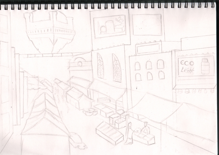
For my second environment I have come up with another floating island castle which will again feature a dragon. Below, this time is a busy market place. I have done this in this way because I wanted to convey a traditional medieval feel where market places were quite frequent. I have also done this environment to convey my story because I wanted to set the scene of where the characters are set in, also the reason why I have added the dragon was because I wanted to show the unsuspecting danger that is about to come over the busy town.
Ideas Development
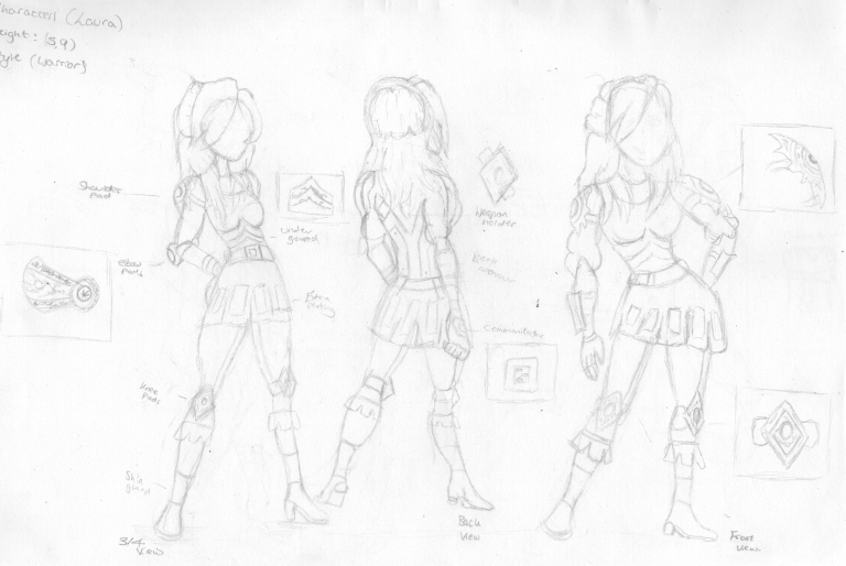
Character: Laura
Height: 5,9
Style: Warrior
Here is a front, back & 3/4 view of my character Laura. As you can see I have gone into more detail with how her armour, clothing etc is presented at each point of view.
Use of colour
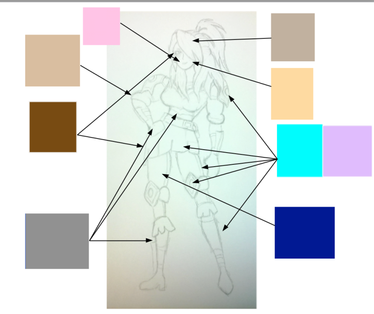
Here are the type of colours that I will use for this character. As you can see I have tried to stay true to my vision by using a mix of traditional/natural colours like brown & using futuristic colours as well like neon blue.
Colour Code
Pink: Lips
Light Brown: Shirt
Medium grey: Boots
Dark Blue: Trousers
Light blue & Purple: Knee & Shoulder pads
Mousse Brown: Hair
Character Development
Black & White
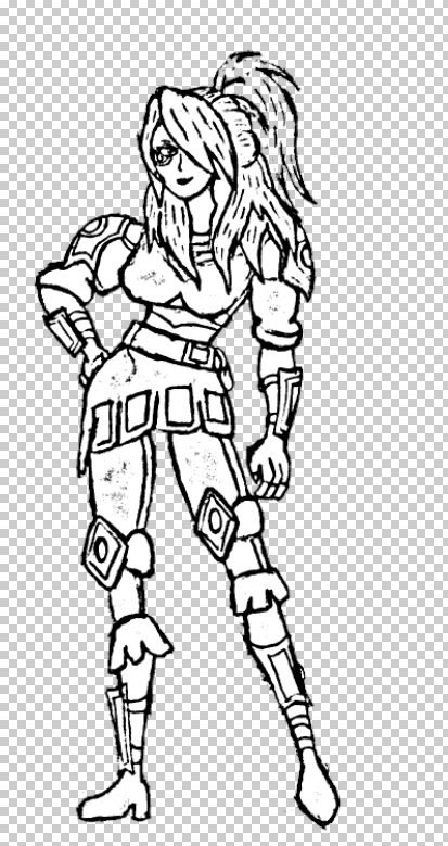
Here is the blank version of my character. As you can see the style I have gone for is true to my ideas generation where I wanted to create a warrior that wasn’t like what has been seen before.
Colour
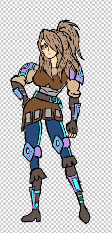
Here is some more development of my character. The colours that I have used are very traditional/ natural with the character clothing being different shades of brown & the boots. I have also conveyed the theme of futurism with the character’s armour as the neon blue protects the character from great deals of damage.
Shading
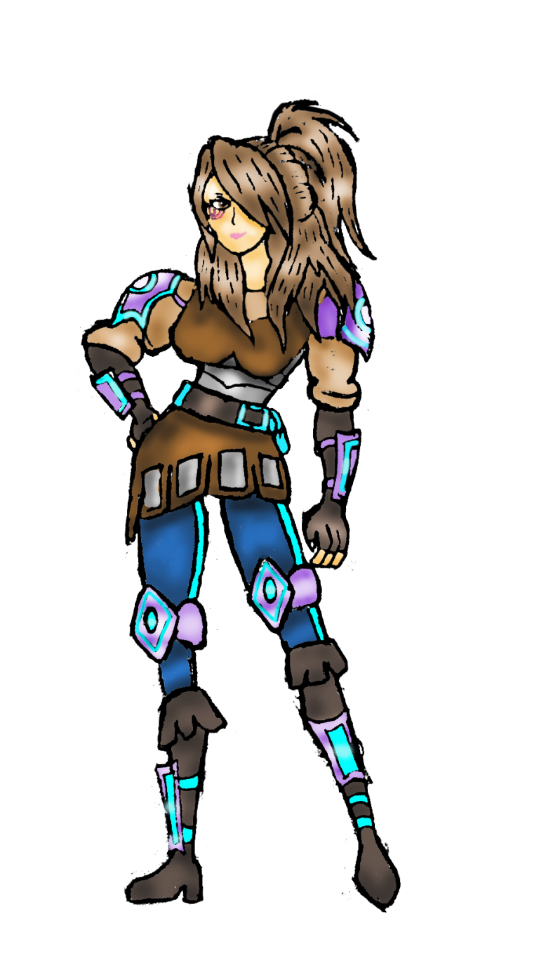
Here is the finished version of my first character. With the shading process I have managed to make the character look more effective by adding different shades to the character’s whole form to make her look more realistic.
Character 2: Nadine
Character Concept Views

Character: Nadine
Height: 5, 3
Style: Peasant with hint of warrior
Character Development
Black & White
Here is the blank version of my second character. As you can see I have again stayed true to my intentions by making her design more like a peasant feel with the puffy trousers, the archer hood & boots.
Colour & Shading
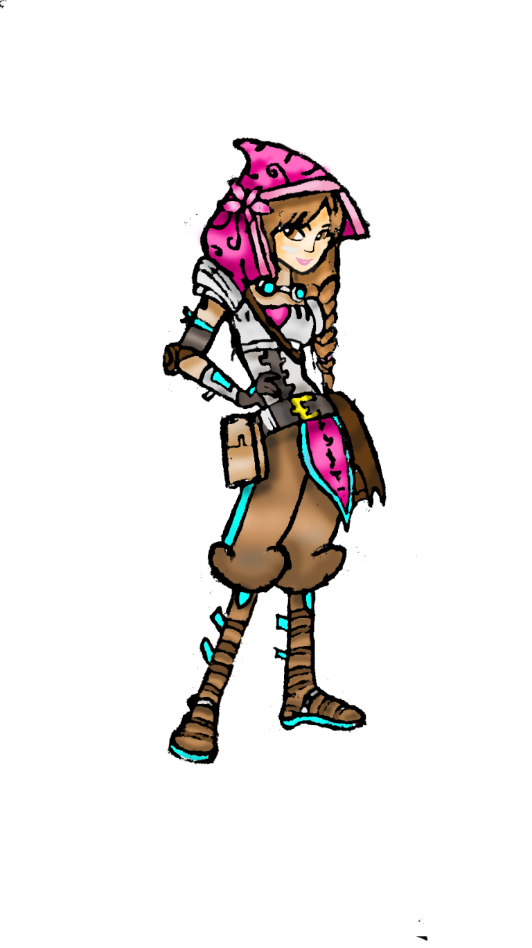
Here is the finished version of my second character.I think that the shading again makes the character look more effective & realistic.
Character 3: Talon
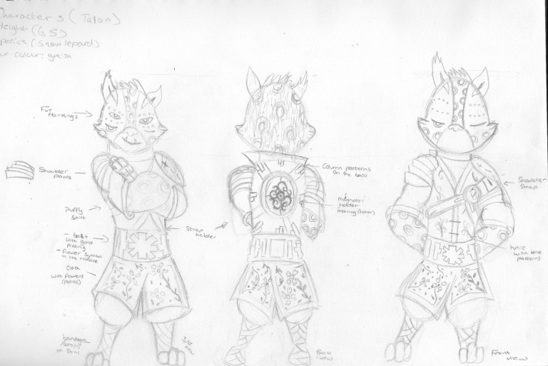
Character: Talon
Height 6,5
Style: Traditional
Here is the front, back & 3/4 view for my character Talon. As you can see the character’s style features a traditional Chinese feel.
Use of Colour
 Fur
Fur
 Pattern
 spots
spots
 fur
fur
 Tunic & Cloth
 pants
pants
 wraps/bandages
Character Development
Black & White
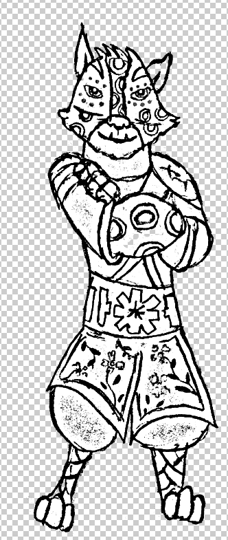
Here is a blank version of my third character Talon. With this character I have kept him to a traditional style & I have created him to an extent to where his style completely contrasts with the other two because his style is like a Chinese theme with the simple but unique character’s on the characters clothing.
Colour & Shading
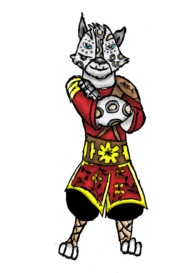
Here is the finished version of my third character. As you can see I have conveyed a traditional Chinese theme by colouring the character in a traditional theme.
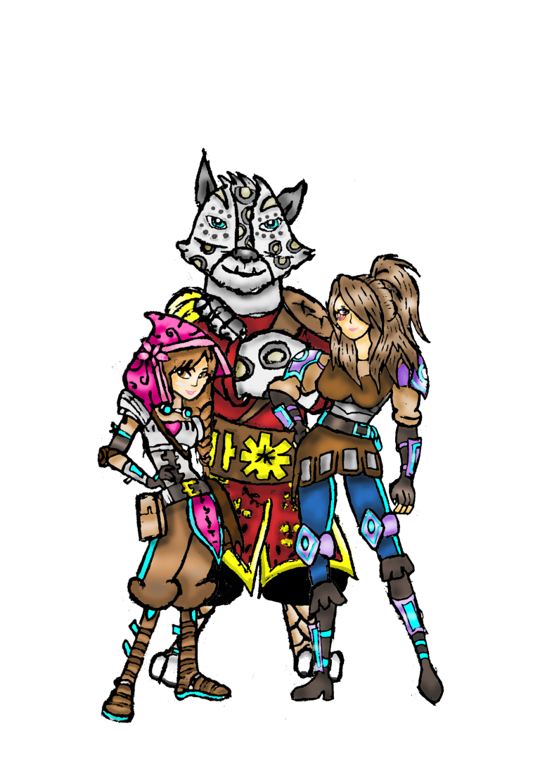
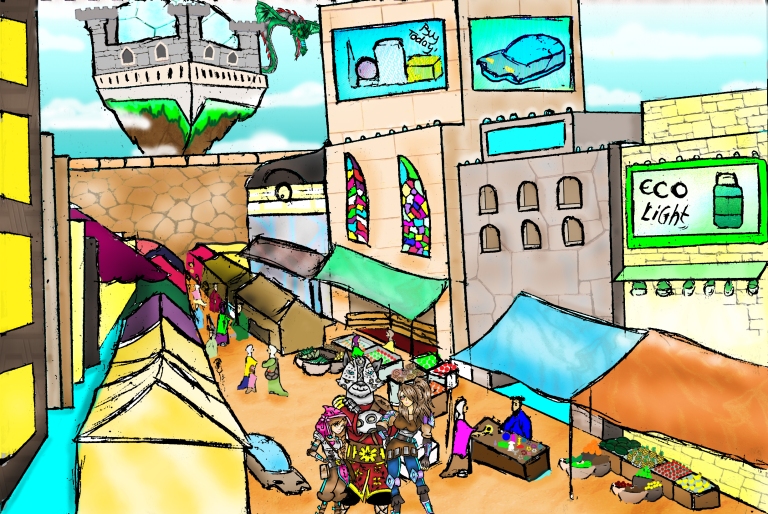
Here is the final version of all of my characters & how they would be presented in my environment.As you can see also I have tried to stay true to the heights I put them at in their turnaround drawings with Nadine (Left) being 5,3 , Laura (right) being 5, 9 & Talon being 6,5.
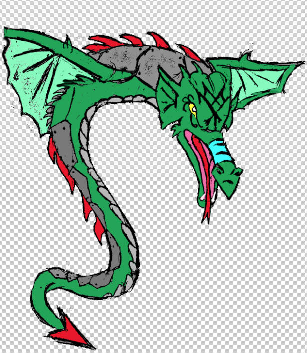
Dragon Development
Black & White
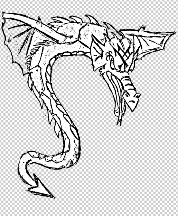
Here is a blank version of my dragon Gardath. This particular style of dragon is a mix between a snake & a dragon. I have also given my character armour so that it is much harder to defeat & He also has a better advantage on the field as he can slither to surprise his enemies as well as fly.
Colour
Here is the coloured in version of the dragon. The reason why I have chosen these particular palette of colours because I wanted to convey the dragon’s menacing appearance.
Shading
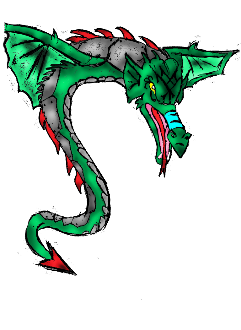
Here is the finished version of my dragon. I feel like the shading is very effective on this particular artwork because it makes the dragon look more menacing.
Environment (Primary Research)
Textures

For the textures within my artwork, I wanted convey the traditional feel from my characters to my environment. So I decided the building’s walls will have stone textures.
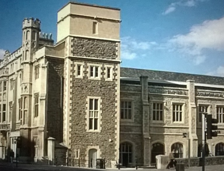
For the textures of my buildings, here is an example of stone cobble wall style which is what I want to convey into my artwork.
Environment Development
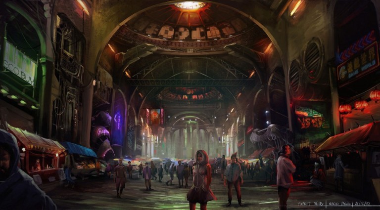
Pencil
Here is my first draft of my environment. As you can see I have decided to go for the market place background. I chose this particular setting because I really like this design more & I think it helps to convey my story more as it sets the scene of the story before it begins.
Colour
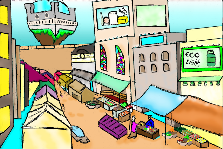
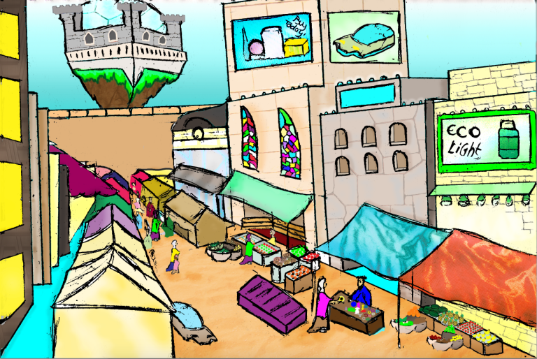
Here is the coloured version of my environment. As you can see I have gone for a colourful aspect towards my environment. I also thought that because in my vision of futurism I think that the style of futurism is a colourful theme, which is why I have done this in this way. I have also conveyed the theme of medieval by adding traditional stalls, a castle, canopies, tents, sand etc.
Textures
By adding the textures, I think that it makes features of the environment look more effective & I think that it makes it look more realistic.
Weapon

For my weapons I have decided to go for a less violent approach, so instead of my weapons killing, my weapons will open up into traps, like the bow & arrow at the top, or they will stun enemies with an energy blast.
( I decided that I didn’t want to use weapons in my concept art, so this was never developed. However I do still like the idea of non lethal weapons, so I may use this in a future project.)
Produce Outcome
Final Evaluation
What was the task that was presented?
In this unit we were tasked to produce a concept artwork for a proposed game/story/animation. In order to approach this we had to stay away from cliches as much as possible & produce our own artwork in a creative aspect, which meant that we had to put things together that is never see like the example we were given, Pride & Prejudiced & Zombies. We also had to create the artwork with a mix of traditional & digital techniques.
Using the different methods & techniques from the workshops we learned at the start of the unit, which we had to use within our drawings for the artwork that was going to be compiled into one concept art.
We had to do this by creating a minimum of three characters, objects & artefacts & an environment that was relevant to the story that we were trying to create.
What was your original intentions for your concept art?
The original intention for my artwork was to create a concept art that conveyed my story well & set the scene of where it all starts for my characters. I also wanted to show that each character I created was completely different from one another & that their personalities reflected from how they are presented so that when they are seen the viewer can gain a deeper understand of who these characters are. The final intention for my artwork was that I wanted the environment to convey a a multiple things, like for example I wanted the use of colour within the environment to make it seem that it all is well, but I also wanted something to convey the theme of danger which would cause problems for our characters.
How does your finished artwork compare?
I think that my finished artwork compares to my original intentions because I think that the environment that I created conveys my story perfectly. This is because I believe that the scene with the market place helps sets the scene for where the story first starts off which is set in the village Silvan. I also think that I have conveyed the themes that I chose for my artwork is presented very well in this piece, because I have used both elements of futuristic & medieval. I have conveyed the theme of medieval within the market place as the stalls are quite simple & the buildings are made up with stone wall textures. I have also conveyed the theme of futurism in many aspects of the artwork as well with the hologram adverts on the buildings, the hover car & the floating island with a castle that is protected with a dome.
The atmosphere that is presented within my environment also conveys my original intentions, because with the use of colour that I have used within the environment gives off a light aspect which means that it is going to be a happy story. But, I have also managed to convey the danger theme by adding in the Dragon Gardath behind the floating island. I think that by adding this particular element I think I have conveyed the aspect of calm before the storm because the atmosphere is light & happy now, but when the dragon hits the village, it won’t be happy anymore.
I also think that my characters compares nicely to my original intentions as well because I created the characters to present different personalities & meanings, like for example the character Nadine (who is on the left), has a water lily on her hood which is sometimes interpreted as enlightenment, which to me means that this character is a nice, gentle person that is a peacemaker. Laura (who is on the right), has swirls under her left eye, which can be interpreted as energetic, which shows that this is a character that is full of life. The Final character Talon, has connected swirls with an eye in the middle(seen in turnaround of Talon), which I interpret as Honour, which means that this character is respectful, is wise & competent. The reason why I have done these characters in this way is because I wanted to follow my original idea & present who these characters are with the use of colour & symbols.
What traditional & digital techniques did you use?
Traditional
The traditional techniques that I have used for this project is hand drawing because since I love the artist aspect I had no problem in drawing the different aspects & the process of my project in drawn form. I specifically love the fact that you can draw something, then just scan it in to the computer without having to lose any or change any of the work. I think that this process makes the work more natural as you were the one that created it.
Digital
The digital technique that I used for the project was photoshop. Since I have a good amount of experience for this application I found it very easy to process my vision through the tools that are available in photoshop. Even though, I have only started using photoshop in last years course, I feel that the technique is very effective in creating a piece of artwork because you get to add so many things that can’t be done traditionally. My favourite aspect of photoshop is the dodge & burn tool because it allows you to add shading & lighting to different elements of the environment which helps to make the environment look more realistic instead of flat. Another of my favourite tools is the Gradient tool because it allows you to add background colour to your environment that helps represent the environment, like for example in my artwork I used the gradient to create a blue sky that goes from dark blur to light instead of a flat blue colour.
What techniques from the workshops did you use?
With my concept art I have used many different techniques from the workshops, like for example I have taken my knowledge from the perspective drawing workshop & I have explored how to refine this better, so now I think that this artwork is a real improvement from my first attempt, because I have managed to make sure that everything is in the right perspective & I am proud of what I produced
I have also used techniques from the heads & hands workshops as well as constructing the human form because I have used these techniques on how my characters are presented. By learning these workshops I have learned how to construct the characters, specifically the characters hands because although I can draw some different positions of the hand, I can’t draw them all, so by going through the process of constructing a hand I managed to create the positioning correctly.
What went well in your concept art?
I think that the majority of this project went very well for me because I knew exactly what I wanted to present & what story I was trying to create with these characters. The drawing aspect of this project is what I particularly enjoyed because drawing is one of my most favourite things, so I had no problem drawing the character themselves, the environment etc. I also enjoyed learning to draw in different view points in drawing characters because in order to gain a deeper understanding to drawing a character in these different views I had to research how these are drawn & I think that this first attempt was very successful. Another aspect that went well for me was the photoshop aspect because I have experience in this application, I already knew how to add shading, lighting, textures, gradients etc.
What could you improve?
There is not really anything that I could improve to this, but I think if I had more time I would of liked to create a different environment that would of conveyed my story more like the forest I drew back in my environment idea generation. I would also liked to have my characters a bit larger so that they could be seen better, but because of the way that I have drawn the environment I had to keep them in perspective so they had to be smaller but not too small otherwise you can’t see the detail. I combated this by bringing my characters forward more so it looks like the people behind the characters are farther away. Overall I am very proud of what I produced & I would love to do a project similar to this again.
