Workshop 1: Intro to Html
The task for this workshop was to learn the basics of HTML & the tools that are required to create a webpage with the required minimum tools. In order to create a webpage using HTML, we first needed to learn how elements, attributes & values are constructed in HTML & how to make a basic web page which is compatible to the latest version of HTML/HTML5.
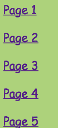
The first challenge was to create a webpage with 5 html pages which all had to be linked using an html unordered list menu showing page 1, page 2, page 3, page 4, page 5. Each page also had to have a different paragraph of text, web link to a different external website on each page & a different image on each page.


Attributes learned
During the first task I learned many things about HTML, like for example I learned how to embed images & videos on a HTML, how to link each page to one another, adding links, text etc. Below are a few examples.
Workshop 2:Intro to CSS
In this workshop we had to explore the basics of CSS & the required tools to style web pages. So, in order to learn the basics of CSS we had to learn how selectors, declarations, properties & values are constructed in CSS, then experiment with CSS to style the web page using different css selectors.
Below is the now styled version of my webpages & as you can see I have learned how to construct my CSS in order to style different elements of my webpage.


Workshop 3: Intro to layout
In this workshop, we had to learn how CSS & HTML control layout on the webpage.In order to do this we needed to learn how to align objects properly on an Html page & how they can appear differently in a web browser.
As you can see here, I have been successful in using Divs & id classes in order to align paragraphs to a specific areas of the page.
Workshop 4:Intro to semantic layout
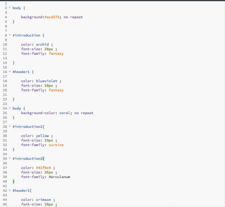
In this workshop we had to explore how to use the new semantic html elements which should be used in place of divs in HTML5. This part of the coding took place in the Css style sheet because the CSS is the page that is responsible for the creative side of the webpage as opposed to HTML which is only for the basic coding.
In the image below it shows the style for each of the elements of the webpage which include the headers, text, body & even images.
Code Academy
In code academy, we were tasked to learn more lessons about HTML/CSS. In these lessons, I learned more about Divs, Tables, Fonts, Id Classes etc. I also learned about selectors that could make a specific part of text bold & italic, that you can have more than one font style on a piece of text because the computer may not recognise it, creating different header sizes, ordered & un ordered lists & how to add styles to paragraphs, titles and headers in a simpler way.
Here is the badges that states I have completed HTML/CSS lessons.


Research
Image formats for the web
JPEG

JPEG is a lossy compression technique for colourful & complex images like a photograph; images containing gradients or colour blends; and any other images with millions of colours. Even though it can reduce file sizes about 5% of their normal size, some of the data is lost because the file is compressed. JPEG files can be saved in various quality settings which are measured as a percentage of the original quality. The lower the quality percentage, the higher the compression rate.
http://www.digitalfamily.com/tutorials/whats-the-best-image-format-for-the-web/
https://en.wikipedia.org/wiki/JPEG
http://www.bbc.co.uk/schools/gcsebitesize/dida/graphics/selectingrev6.shtml
PNG

PNG generally produces better-looking images with smaller file sizes than GIF for the same kinds of limited-color images. Really old browsers, such as IE 3, don’t support the PNG format, but most Web designers now choose this format over GIF because so few people use such old browser. Browsers as recent as IE6 don’t display transparent PNG files properly, which is unfortunate because PNG files tend to handle transparency better.
GIF


Gif’s are generally used for line art such as one or two colour coded logos, simple drawings, animations & basically any image that has no gradients.GIF is also the best format when you want to display an image with a transparent background.
File Optimisation
File Optimisation is where it arranges the file on the hard drive in a way that allows it the fastest possible access to the files used most often. Since all file searches are done by moving he hard drive’s head to the center of the hard drive, rearranging the system files for Windows to the centre of the drive will optimise performance. As you use files over a period of time on your computer, they will become fragmented. This means that part of one file may be stored in several different places on the drive. When optimised using the Desk Defrag, it moves all the parts of a file together for fast access.
http://royal.pingdom.com/2008/11/20/speed-up-your-website-by-optimizing-files-and-images/
https://au.answers.yahoo.com/question/index?qid=20080519061057AAYS6sy
File formats for the web
HTML5
HTML5 is a markup language used for structuring and presenting content on the web. It is the current version of the HTML standard. HTML was created in October 2014 by W3C, which purpose was to to improve coding language with support from the latest multimedia, while keeping it easily readable for us. This type of language is also consistently understood by computers & devices like web browsers.
https://en.wikipedia.org/wiki/HTML5
CSS
CSS or Cascading Style Sheets, is a feature in HTML that gives both Web developers & users more control over how pages are presented. With CSS, designers & users can create style sheets that define how different elements, such as headers and links, appear. These style sheets can then be applied to any Web page.
Javascript
Javascript, is a high-level dynamic programming language. Alongside HTML & CSS, javascript is one of the three core technologies of the web content production; most websites include its programming & it is supported by all modern browsers without plug-ins. Javascript is prototype based with first class functions, which makes it a programming system that supports more than one programming paradigm. It has an API for working with text, dates & regular expressions, but does not include any I/O, such as networking, storage, or graphics facilities, relying for these upon the host environment in which it is embedded. Even though there are strong outward similarities between JavaScript and Java, including language name, syntax etc; the two are distinct languages & differentiate greatly in their design. JavaScript was influenced by programming languages such as Self & Scheme.
https://en.wikipedia.org/wiki/JavaScript
Multimedia Plugins
The Multimedia plugins filter is responsible for finding a link in text that points to a multimedia resource & replaces the link with the right multimedia player code which can play the resource. The actual player is present on each users’ computer.
https://docs.moodle.org/22/en/Multimedia_plugins_filter
Mobile First Methodology
Mobile first is a strategy in website development where designing a website for smartphones, tablets & other mobile devices is the primary objective over desktop web design. With a mobile first strategy, a web designer will build a site given the constraints of a mobile platform where screens are smaller & have slower processors & then it is either copy or improve the site for a desktop user.
http://www.investopedia.com/terms/m/mobile-first-strategy.asp#ixzz4BwtC1S3s
Tables
HTML tables allow web designers to arrange data like text, images, links into rows and columns.The table is created using the <table> tag in which the <tr> tag is used to create table rows & <td> tag is used to create data cells.
http://www.w3schools.com/tags/tag_table.asp
http://www.tutorialspoint.com/html/html_tables.htm
Divs
The divs tag is a case that encloses other page elements & divides the HTML document into sections. Web designers use div elements to group together HTML elements & apply CSS styles to multiple elements at once. For example, by wrapping a set of paragraph elements into a div element, the designer can take advantage of CSS styles & apply a font to all paragraphs at once by applying a font style to the div tag instead of coding the same style for each paragraph element.
http://www.w3schools.com/tags/tag_div.asp
https://en.wikipedia.org/wiki/Span_and_div
http://www.tizag.com/htmlT/htmldiv.php
Semantic page elements
A semantic element clearly describes its meaning to both the browser & the designer. An example of this is : <table> & <img> because they clearly define the content that is to be placed on your webpage . However there are elements that do not tell us anything about the content we are trying to display, these are:
& .
http://www.w3schools.com/html/html5_semantic_elements.asp
Cross Browser compatibility
Cross-browser means that a website is compatible with multiple Web browsers. This means the Web pages show up correctly in different browsers, such as Safari, Internet Explorer, Firefox & Chrome. Cross-browser sites sometimes may need to generate custom HTML or JavaScript in order to be compatible across multiple sites.
https://en.wikipedia.org/wiki/Cross-browser
Responsive Design & Layout
Responsive web design is an approach to web design aimed at making sites to provide an optimal viewing and interaction experience,easy reading and navigation with a minimum of resizing, & scrolling across a wide range of devices from desktop computer monitors to mobile phones.A site designed with responsive web design adapts the layout to the viewing environment by using fluid, proportion-based grids,flexible images & CSS3 which is an extension of the media rule, such as: flexible images are also sized in relative units, so to prevent them from displaying outside their containing element. Media queries allow the page to use different CSS style rules based on characteristics of the device the site is being displayed on which is most commonly the width of the browser.
https://en.wikipedia.org/wiki/Responsive_web_design
Web Design Issues
Internet Connection Speed
Many internet users do not have high-speed internet access, so it should be taken into account that a website designer needs ensure maximum browsing pleasure for the user. Website designers often make the mistake the impact that images, fonts, animations & video have on the load speed of their web pages as the information & media can overload the it to a point where the website it slows to a crawl & attack visitors with so much information that they cannot possibly take it all in, resulting in forcing the load back to Google & on to a more compatible result alternative. Web designers also need to make sure the loading time for information is quick because otherwise users will get bored & leave. This also applies to downloads. The solution to this is to keep file & image sizes to a minimum & limit the number of resources downloaded & displayed on the screen.
Screen Resolutions
Device screens & monitors with web capability come in all shapes & sizes, so it can be difficult to determine what size you actually need to put your website in order for all users to get full pleasure in browsing. The web design in general shouldn’t be based on any fixed size at all. The solution to this is that the web designer should aim to build a responsive website that fluidly shift, flow & adapt to any screen regardless of size or orientation. The most effective of these practices is the mobile first approach, which begins with a website that looks good & functions fully at its slimmest, linear proportion & then the layout adapts to either 2 or 3 columns as the screen gets wider.
Device Suitability
The differences in bandwidth/data transfer & multi-media functionality also play a huge part in how successfully a website can be used on handheld & mobile devices, as well as desktop computers. On a desktop, a mouse hover function work perfectly with a swipe of the mouse, however these actions that trigger on hover do not bode well with touch screen devices. Web designers need to think about alternatives for on click & tap functions, coupled with a large button or bar instead of a small text link that can easily be poked by a finger on small touch screen.
We also can’t use too much of a range with the scripts or images as mobile packages can’t handle the heavy image downloads, or complex script functions & many devices have this feature disabled in order to prevent data overuse. It’s quite forgettable that what takes 2 seconds on a desktop, can take more than 15 seconds to load on a 3G mobile, which users won’t like to wait around for because there are a million other things that they can do.Limited screen space also forces us to re-evaluate the organisation of content & while it’s always best to put priority content at the top of any web page, it becomes even more critical on small screen devices where users can’t easily scroll to the bottom of a long page full of content.
Cross-browser compatibility
There is quite a range of web browsers in this current age which include: Internet Explorer, Safari, Firefox, Chrome & Opera. Because of the widespread browser differences, the web designer must check that their website works properly across all of them, which means that its appearance is error-free & functional, on any browser used to view it. A professional website will work equally & will look almost the same in all browsers.
Web technologies
Some web technologies, when used poorly can obstruct users from navigating a website or reading content which include; AJAX, Flash, HTML Frames & JavaScript. If a website relies heavily on these technologies for navigation, it can negatively impact on the page rank in the search engine. Since sub pages cannot be easily linked to, the homepage becomes the only source for a linkable base which does not bode well with user bookmarks. The problems that come from this is that users can’t save them, so uncovered content frustratedly reverts back to being hidden in the depths of a difficult site. This gets the user to abandon your site & look for alternatives.JavaScript only works if a users’ browser first loads, allows it to be used & a majority of people disable it to avoid popups & to help speed up websites using slow external resources, such as banner-ads & social networking plugins. For a website that uses JavaScript loosely, the user’s version will undergo formatting, but the important content will still be accessible. However for a website with a massive majority of JavaScript to display content & render menus, users will not even get access to basic important information. A web designer with experience will consider & explore these potential risks to their website while using these technologies carefully because overusing them & writing poor code will render your website useless.
http://fofwebdesign.co.uk/faqs/what-are-the-main-technical-issues-in-web-design.php
Website structure research
For this part of my research, I will like to look for different style structures on webpages in order to get an idea of what direction I would like to go in for my own webpage.
Cineworld
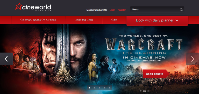
The Cineworld website has a very wide range of different elements; the website has many visuals, texts & in web advertisements in order to get the viewer interested to see the film. From this image, I think that I may want to use the idea of a slideshow for my website because like it is shown here, it shows off many popular film posters to catch the viewers attention.
Overwatch
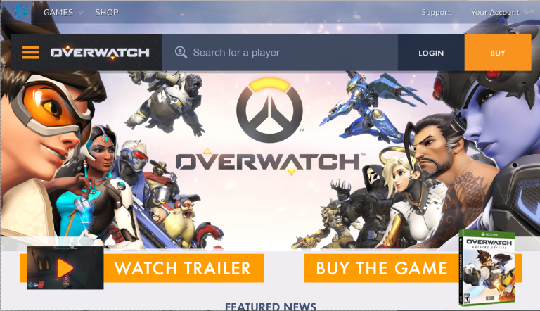
The Overwatch official website design is very clever because it has a unique trait as opposed to the Cineworld website which is the fact that the homepage is mobile. What I mean by that is that when you move your mouse over the characters, they either move forward or backward depending on where the mouse is. Also in the background, I believe it may be cherry blossom petals peacefully floating behind the characters of the game. I think that this little animation in the background is a lovely design & I hope I can find a way to incorporate this into my own website.
https://playoverwatch.com/en-us/
Apple
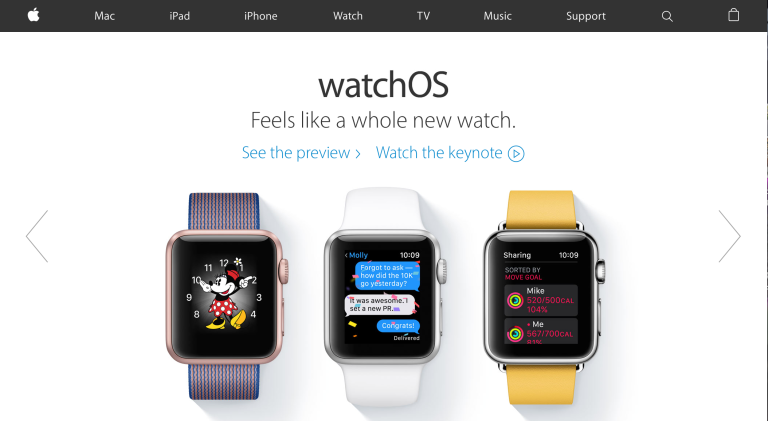
Apple’s website design is a very simple yet effective design because everything is easily seen, there is a slide show which advertises each of Apple’s products,which is straight to the point with out the hassle of trying to find it, it has a very simple navigation bar which means all areas of the website are easily accessible & the website is also categorised in a way that not every product is mixed in as they all have their own pages so that the user doesn’t get confused.
Youtube
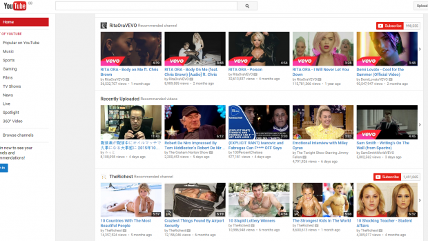
Youtube is a very organised website with all of the videos uploaded on to the site being laid out in categoric rows so that it is very easy to see & find the related video that the user is trying to find on youtube. Considering this is a very effective way to categorise content, I think I may use the grid layout for my own website for my artwork, but I don’t know if I would use it in a sense of separating it out into many different sub links (like playlists).
Pharrell Williams Personal Website
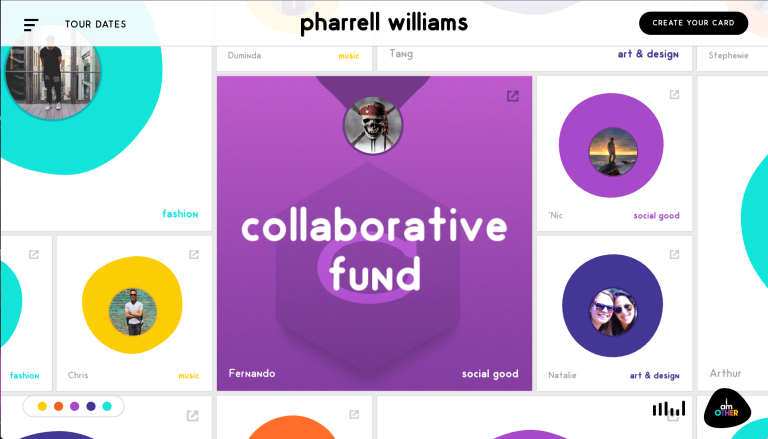
This website has a very creative layout because when you hover your mouse over each of the circles, it fills the block with the colour of the circle & shows what information is going to be shown if you click on it. I also like the fact that if you look in the left hand corner, you see that there are different colours that are present on the circles which means that even though all of the circles are all over the place, the designer has still found a way to coordinate the content on the page. Another thing I like about the the website is that there is music playing so as you go through the website, you can listen to some funky music. I don’t know if I will use this design in my own website, but it is a very creative & funky design & a great idea for someone doing a portfolio because you can express your creativity through the design.
Christopher Lee
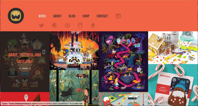
This website’s placement is one ideal way of laying out a portfolio with its grid like layout of imagery of the artists work, a simple navigation bar & little logos underneath that take you to separate projects. I also like the fact that when you hover your mouse on an image, it shows you the title of the artwork & then how to view it. I would like to include some of the elements included in this website on my own because it is an effective way to show off artwork, however I don’t think I would use the layout of it being compacted together because to me it looks a little less organised.
http://www.thebeastisback.com
Proposal
Section 1
Working Title: Birdie’s Portfolio
What you will work towards producing?
I will work towards producing a website based portfolio that will display my creative artistic work that people & possible future employers will see. The coding language mark up that I will be using for my website will be HTML & CSS & maybe alternative programming language like Javascript.
Section 2
Influences, starting points and contextual references:
The websites designs that I am influenced by for my own websites are for example, Cineworld, Apple, Youtube & Christopher Lee’s portfolio. The starting points I am going from are: Apple’s simple, functional & adaptive layout, Cineworld’s slideshow advertisement, Youtube’s grid like layout & Christopher Lee’s Imagery & structure. I believe that these types of websites are exactly what I need for my own website because if I use a simple layout for my website it will speed up loading times for the user on all devices. Also, if I use the grid like layout for my artwork, it will look more structured & professional so the user can look through them with ease. Finally, I believe that by using a slide show on my homepage will help to clearly define & help sell the site to the users to encourage them to look for more. I will start this by researching & learning from tutorials for building a website with HTML & CSS.
Early ideas research & sources
My early ideas research will come from already existing portfolios & webpages that may include the elements that give the designer the unique edge of interactivity for the user & the webpage. I will also gain sources from tutorials that will help me to develop specific elements for my webpage in order to make my vision a reality.
Section 3
Intended techniques, non digital & digital processes:
For this project, I intend to use the traditional way of HTML & CSS techniques in order to build my portfolio website. For example, for styling my webpage can be achieved through CSS coding which is helpful for fonts, colour, height, width etc. I will also need to develop a paper prototype & a wireframe so that I can gain a better understanding of what I want achieve for my site.
Timescale
11/05/16 – 25/05/16
For the first part of this unit, I would like to start & finish my search into existing websites to get some ideas on what I would like to achieve from my website. I will also like to learn the technique & methods that there are so that I can gain an understanding on how to structure my website.
29/05/16-05/06/16
In this week, I will need to start coming up with ideas for the website’s layout,style, content placement & features to make sure the website will satisfactory for the user to use. I will also need to draw simple illustrations for the layout of my website so that I can decided what to change or keep.
06/06/16-19/06/16
Start & finish designing the website, I will need to figure out which ideas will work & the building of the visuals & layout. I will also need to finish all the coding for the HTML and CSS in order to achieve a adaptive website.
19/06/16-21/06/16
For the final part, I will need to start & finish my unit 44 evaluation in order to complete this project.
Section 4
Proposed methods of evaluation
I will use my own work for the evaluation, starting from the research to the final outcome that will be on my blog. I will also use some students as a way for feedback and along with the results from the paper prototypes and wirerframes. Alongside this my own input on the work will also go into the evaluating stage.
Ideas Generation
Idea for webpage layout
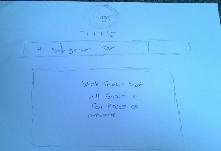
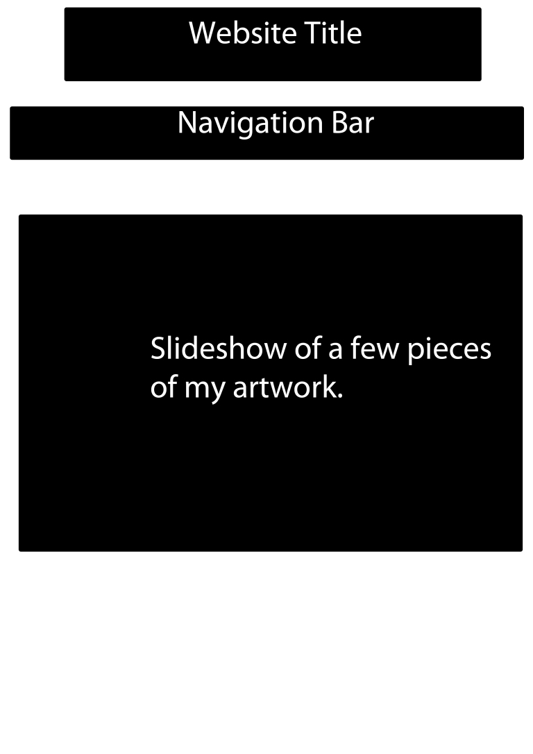
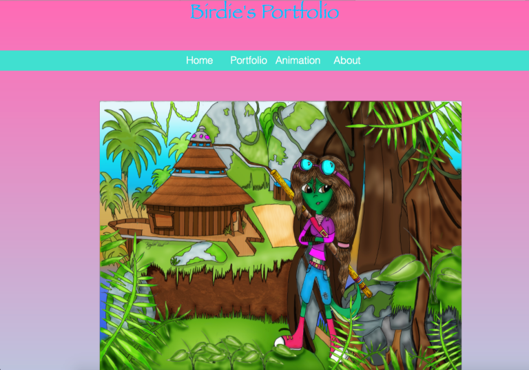
For my webpage, I was thinking of something along the line of this for my layout. On my homepage, I was thinking of maybe having a logo at the top in the middle, however this may change in development. Also, I want to put a simple navigation bar below the title of my portfolio which will link to the portfolio page, animation (possibly) & contact information. Below all of this, I would like to include a slideshow which will include a few of my pieces of artwork so I can sell it to the the user straight away & interest them to see more.
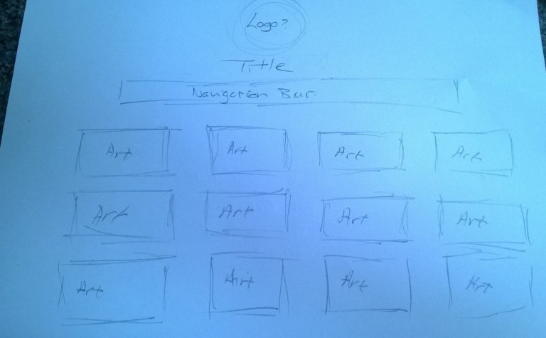
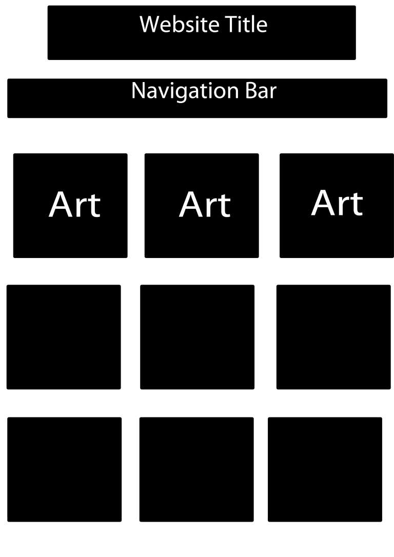
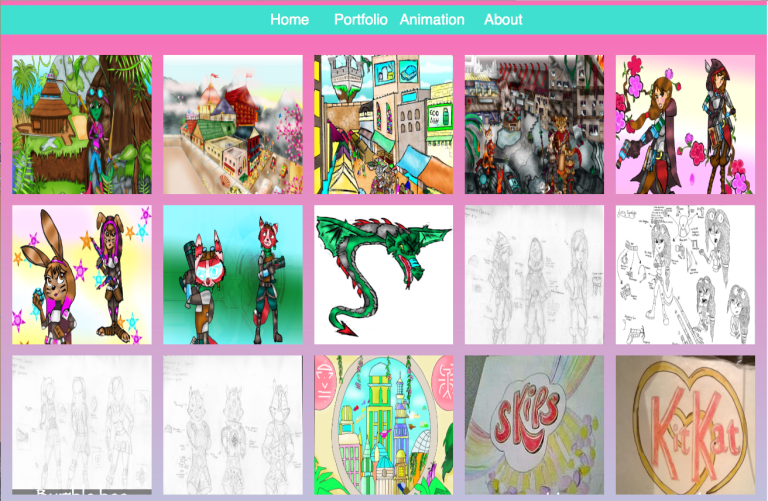
Here is an idea that I would like the layout to look like for my portfolio page. For the structure of my artwork, I would like it to be displayed in grid form that is equally placed apart so it looks professional.
Ideas Development
Paper Prototype
Wireframe
 I started to build my website portfolio page on brackets. First of all I created the main elements of the homepage; the navigation bar, title, the slideshow & the links to the other pages to my website so I could access the page with my artwork.
Navigation Bar
Now, considering I don’t know how to do the navigation bar, I started to research a range of different sites to find out how to create a navigation bar. After searching a couple of sites like these below;
HTML
</header>
CSS
body {
margin: 0;
padding: 0;
background: #ccc;
}
.nav ul {
list-style: none;
background-color: #40E0D0;
text-align: center;
padding: 0;
margin: 0;
}
.nav li {
font-family: ‘Oswald’, sans-serif;
font-size: 1.2em;
line-height: 40px;
height: 40px;
border-bottom: 1px solid #888;
}
.nav a {
text-decoration: none;
colour: #fff;
display: block;
transition: .3s background-color;
}
.nav a:hover {
background-color: purple;
}
.nav a.active {
background-color: #40E0D0;
colour: #fff;
cursor: default;
hover: #005f5f;
}
@media screen and (min-width: 600px) {
.nav li {
width: 120px;
border-bottom: none;
height: 50px;
line-height: 50px;
font-size: 1.4em;
}
/* Option 1 – Display Inline */
.nav li {
display: inline-block;
margin-right: -4px;
}
/* Options 2 – Float
.nav li {
float: left;
}
.nav ul {
overflow: auto;
width: 600px;
margin: 0 auto;
}
.nav {
background-color: #444;
}
*/
}
With this code, I was able to create a simple navigation bar that would allow the user to traverse the website easily. This type of navigation bar is exactly what I wanted for my website because it is simple & not complicated so that it will cut down loading times on loading the homepage. I also had to tweak the code in some places in order for the code to work for my website, like for example I had to change the margins, colour, alignment etc.
Slideshow
The next thing I worked on was researching a code for embedding a slide show onto my homepage so that it will show a few pieces of my artwork in a continuos loop. After researching, I came across many uneventful ones below:
HTML Goodies
The first code that I came across from from the website HTML Goodies. At first after reading the code it seemed as though it would work, however when I put it into my own website, all I got was a large outline of a box. After doing a lot of tweaking I got no success, so I then continued to search for alternatives.
code:


After looking around some more, I came across this code below. This code proved very useful & is working really well in my website. The only problem with this is the delay when you load up the homepage.
HTML


CSS
body{
font-family: “HelveticaNeue-Light”, “Helvetica Neue Light”, “Helvetica Neue”, Helvetica, Arial, “Lucida Grande”, sans-serif;
font-weight: 300;
}
.css-slideshow{
position: relative;
max-width: 495px;
height: 370px;
margin: 5em auto .5em auto;
}
.css-slideshow figure{
margin: 0;
max-width: 495px;
height: 370px;
background: #000;
position: absolute;
}
.css-slideshow img{
box-shadow: 0 0 2px #666;
}
.css-slideshow figcaption{
position: absolute;
top: 0;
color: #fff;
background: rgba(0,0,0, .3);
font-size: .8em;
padding: 8px 12px;
opacity: 0;
transition: opacity .5s;
}
.css-slideshow:hover figure figcaption{
transition: opacity .5s;
opacity: 1;
}
.css-slideshow-attr{
max-width: 495px;
text-align: right;
font-size: .7em;
font-style: italic;
margin:0 auto;
}
.css-slideshow-attr a{
color: #666;
}
.css-slideshow figure{
opacity:0;
}
figure:nth-child(1) {
animation: xfade 48s 42s infinite;
}
figure:nth-child(2) {
animation: xfade 48s 36s infinite;
}
figure:nth-child(3) {
animation: xfade 48s 30s infinite;
}
figure:nth-child(4) {
animation: xfade 48s 24s infinite;
}
figure:nth-child(5) {
animation: xfade 48s 18s infinite;
}
figure:nth-child(6) {
animation: xfade 48s 12s infinite;
}
figure:nth-child(7) {
animation: xfade 48s 6s infinite;
}
figure:nth-child(8) {
animation: xfade 48s 0s infinite;
}
@keyframes xfade{
0%{
opacity: 1;
}
10.5% {
opacity: 1;
}
12.5%{
opacity: 0;
}
98% {
opacity: 0;
}
100% {
opacity: 1;
}
}
By using this code, I was successfully able to create a working slideshow that would feature on my homepage. However, when I first put this code into brackets, it did not work very well when I put my own pictures in, so to combat this I tweaked the code in many places which was to do with the positioning, the transitions between each picture, sizing etc. I was very happy when I was able to embed this into my website because I starting to bring my idea together & even though it took me a while to figure it out, I didn’t want to change it because I think it is effective way to showcase some of my work.
My Version
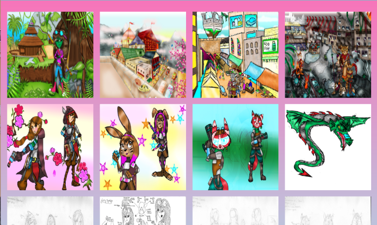
Here is a few of the images of my own that us used in the slideshow.


Gradient Background
While coding my website, I felt that using a block colour on my webpage would be a bit boring to look at; I know that I want my website to be simple but I want mine to be different & I didn’t want to use an image from the internet, so I decided to research for an alternative. While researching, I came across a code that would allow you to use a gradient as background like you would for photoshop, so I decided that I would use it & use a mix of bright & dark colours because to me I think represents creativity due to the flair of colour.
Code

Before
Just Pink

After
Pink, blue & purple

Images in a grid structure
After sorting out the structure of my homepage, I focused my attention to the structure of the portfolio page because I needed a way to effectively display my artwork in a simple way so that all devices can display it on their screens without taking away the experience.
Here is the code I used:
<!DOCTYPE html>
<html>
<head>
<meta http-equiv=”content-type” content=”text/html; charset=UTF-8″>
<!– Enable responsive view on mobile devices –>
<meta name=”viewport” content=”width=device-width, initial-scale=1.0″ />
<title>Responsive Tiled Photo Gallery in Pure CSS</title>
<style type=”text/css”>
body {
margin: 0;
padding: 0;
background: #EEE;
font: 10px/13px ‘Lucida Sans’,sans-serif;
}
.wrap {
overflow: hidden;
margin: 10px;
}
.box {
float: left;
position: relative;
width: 20%;
padding-bottom: 20%;
}
.boxInner {
position: absolute;
left: 10px;
right: 10px;
top: 10px;
bottom: 10px;
overflow: hidden;
}
.boxInner img {
width: 100%;
}
.boxInner .titleBox {
position: absolute;
bottom: 0;
left: 0;
right: 0;
margin-bottom: -50px;
background: #000;
background: rgba(0, 0, 0, 0.5);
color: #FFF;
padding: 10px;
text-align: center;
-webkit-transition: all 0.3s ease-out;
-moz-transition: all 0.3s ease-out;
-o-transition: all 0.3s ease-out;
transition: all 0.3s ease-out;
}
body.no-touch .boxInner:hover .titleBox, body.touch .boxInner.touchFocus .titleBox {
margin-bottom: 0;
}
@media only screen and (max-width : 480px) {
/* Smartphone view: 1 tile */
.box {
width: 100%;
padding-bottom: 100%;
}
}
@media only screen and (max-width : 650px) and (min-width : 481px) {
/* Tablet view: 2 tiles */
.box {
width: 50%;
padding-bottom: 50%;
}
}
@media only screen and (max-width : 1050px) and (min-width : 651px) {
/* Small desktop / ipad view: 3 tiles */
.box {
width: 33.3%;
padding-bottom: 33.3%;
}
}
@media only screen and (max-width : 1290px) and (min-width : 1051px) {
/* Medium desktop: 4 tiles */
.box {
width: 25%;
padding-bottom: 25%;
}
}
</style>
<!– Enable media queries for old IE –>
<!–[if lt IE 9]>
http://css3-mediaqueries-js.googlecode.com/svn/trunk/css3-mediaqueries.js
<![endif]–>
</head>
<body class=”no-touch”>

</div>
</div>

</div>
</div>

</div>
</div>

</div>
</div>

</div>
</div>

</div>
</div>

</div>
</div>

</div>
</div>

</div>
</div>

</div>
</div>

</div>
</div>

</div>
</div>
</div>
<!– /#wrap –>
<!– Add some JavaScript to enable toggling the descriptions when an image is tapped on a touchscreen device –>
http://code.jquery.com/jquery-1.8.3.js
$(function(){
// See if this is a touch device
if (‘ontouchstart’ in window)
{
// Set the correct body class
$(‘body’).removeClass(‘no-touch’).addClass(‘touch’);
// Add the touch toggle to show text
$(‘div.boxInner img’).click(function(){
$(this).closest(‘.boxInner’).toggleClass(‘touchFocus’);
});
}
});
</body>
</html>
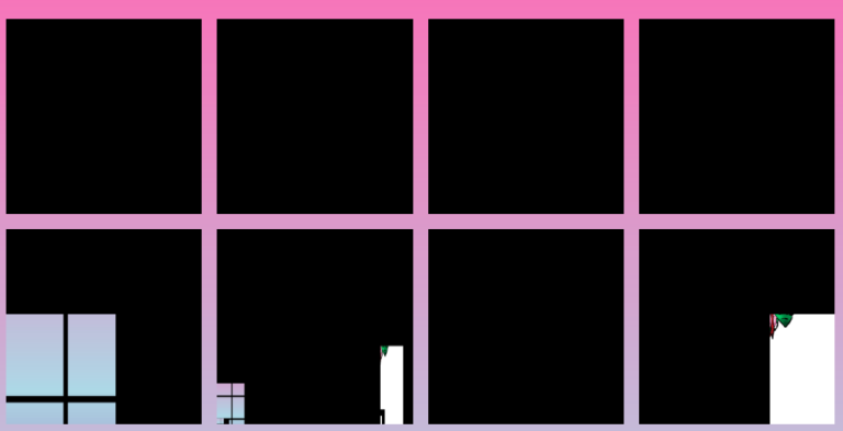
This code was very useful in helping me with structuring the images on the page because before they kept going all over the place which was really hard to make a layout out of because whenever I put another image in, it changed the position of the previous image. I did however, need to tweak the code a bit because some elements of the code were not working in my webpage, but after most of these tweaks it works to an extent, however the only thing I can’t get to work is the part in the code where when you hover the mouse over the image it is supposed to bring a small bar up that will tell you what the image is but mysteriously it does not work & I have tweaked it several times although I will try a couple more times to make it work.
My Version
Problems with website
In addition to me finding excellent codes that I could use in my website, however there were some problems as I was trying to sort out specific codes on each page.
Image Disappearance
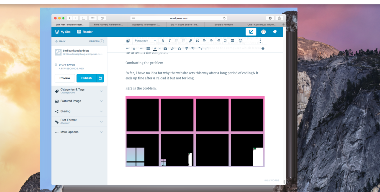
This error occurs when I am coding for a long period of time on brackets. When I go to each page to fix the coding in the text or imagery, I would come back to my portfolio page to find that half of my images would be blacked out. I don’t know the reason why it does this but whenever this happens on the website, it also happens to the computer which forces me to restart the computer.
Combatting the problem
So far, I have no idea for why the website acts this way after a long period of coding & it ends up fine after & reload it but not for long.
Here is the problem:
In this image you can see the website glitching.
After here it is Affecting the computer.
Produce Outcome
 birdieunitdesignblog